The Negotiator's Compass
Cover design and brand identity for a book about navigating the conversations that matter — calm, cinematic, and quietly authoritative.
A Cover Worth Trusting.
An identity as composed and credible as the advice inside — the opposite of a loud, hustle-culture business book.
Authority, without the noise.
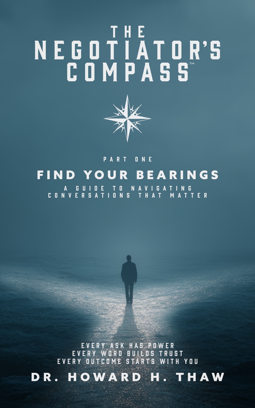
Most negotiation books shout. This one needed to feel like the calm voice in a high-stakes room — the person who's done this a thousand times and doesn't need to raise their voice.
We built an identity around stillness and clarity: a single figure, a long horizon, and a cover that rewards a second look instead of demanding the first.
"Make it feel like wisdom, not a sales pitch."
A Compass for Conversations.
The title gave us our north star — literally.
Find your bearings.
We made the compass rose the brand's anchor mark and set a lone figure walking into the mist below it. The reader is that figure — at the start of a hard conversation, finding their bearings.
It sets up the series too — Part One: Find Your Bearings — a system that carries across future volumes without losing its center, set in wide, deliberate, editorial typography.
Composed, Down to the Detail.
A calm system designed to carry across a series.
Compass Rose
A crisp, classic emblem of finding your way — the brand's anchor across the series.
Editorial Caps
Tall, generously letter-spaced typography with the cadence of someone choosing their words.
Misted Teal
A calm, monochromatic palette with a single shaft of light to walk toward.
Companion Website
Extending the identity to the web — a home for the book and the series. In development.
Have a Book or Brand That Deserves This Kind of Care?
Covers, identities, and the websites that carry them — designed to make the work feel as considered as it is.