
MacFarlands — Brand Refresh & Identity by Toy Dinosaur
One Name, Three Businesses.
A trusted name since 1963 — that nobody could quite place.
Industrial on the job site. Events at the wedding.
To some customers MacFarlands was the industrial equipment company with lifts and trucks across the city. To others it was the event rental company behind the tents and tables at weddings and festivals. One name, one logo, two very different businesses.
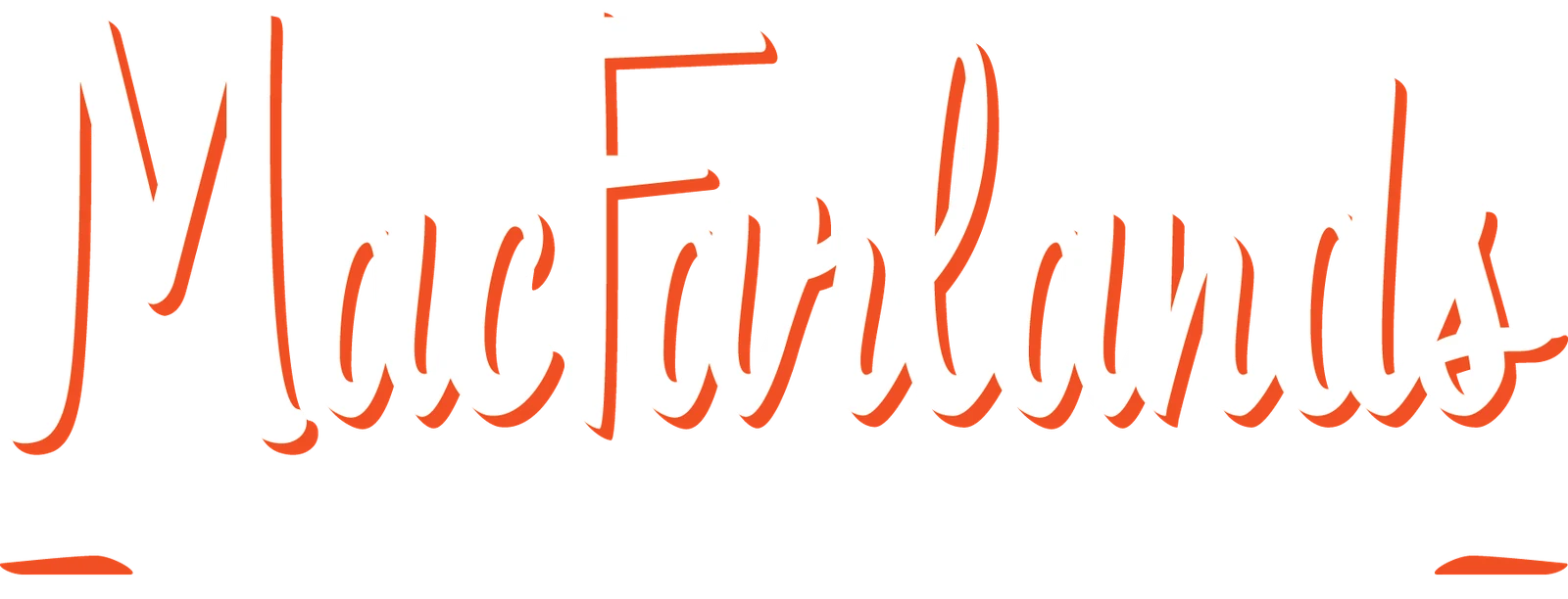
Under new ownership, the company wanted a refresh across everything it owns. The script wordmark was redrawn, anchored with “Since 1963”, and split into three lockups that share one hand: Corporate, Events, and Industrial — orange for the trucks, teal for the tents.
Three Lockups, One Hand.
Each brand in colour on cream and reversed on ink, so the trucks, the tents, and the head office all read as one family.
The M.
A roundel for the places the wordmark won’t fit, in seven colourways.
Black / Orange Black / Teal
 Black / White
 Orange / Black
 Orange / White
 Teal / Black
 Teal / White
Sixty Years In? Time for a Refresh.
Identity systems for companies with history and a next chapter.